A shopper’s eyes move fast down a retail aisle, and most brands never get a second look. If your packaging blends into the shelf instead of jumping off it, you’re losing sales before a customer ever reads your label.
This guide walks through the practical design decisions that actually affect shelf visibility: color and contrast, typography, structure, and how to test your design against competitors before you commit to print. It’s written for founders and designers working on their first retail run, not just big brand teams with research budgets.
Quick Answer
To stand out on a shelf, prioritize color contrast against your product category’s typical palette, make your brand name and key benefit legible from arm’s length, simplify the front panel to one clear message, and physically test your design next to competitors under store-like conditions before finalizing it.
Start With Color Contrast, Not Color Preference
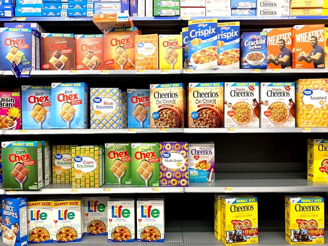
On a crowded shelf, color is doing most of the work before a shopper reads a single word. The goal isn’t picking your favorite color — it’s picking a palette that contrasts with what competitors already use in your category. Walk the aisle (or browse the online category page) and note the dominant colors. If everyone in your category uses green and earth tones, a bold contrasting color can make your product the one thing that pops, even if it’s not the ‘expected’ color for that product type.
If you sell a line of products, keep a consistent color system across the range so the whole lineup reads as one brand block when shelved together, while using secondary color or icon differences to distinguish variants (flavors, sizes, scents) at a glance.
Color psychology still matters for the emotional read — red tends to signal energy or urgency, blue signals trust and calm, green signals natural or organic — but contrast against the category shelf comes first. A psychologically ‘right’ color that blends in still loses to a shopper’s eye.
Design Typography and Layout for Arm’s-Length Reading
Most packaging is judged from shelf distance, not held in the hand. Set your brand name and single most important benefit or flavor in a font size and weight that stays legible at roughly arm’s length, and check how the design shrinks down to a thumbnail-sized image, since that’s often how customers first see it online.
Limit the front panel to one primary message. A shelf glance lasts a few seconds, so a package trying to communicate five features at once usually communicates none of them. Establish a clear visual hierarchy: brand name, then product name or benefit, then any secondary claims (certifications, size, flavor) in a smaller, consistent spot — ideally the same location across your whole product line so repeat customers can find it without re-reading the whole label.
Consider structural choices too. Vertical orientation, a distinctive silhouette, or a transparent window that shows the actual product can all separate you from a wall of similar boxes or pouches, and some structural changes (like switching from horizontal to vertical) can also improve how the product faces out on the shelf and how easily it restocks.
Test Before You Commit to Print
Don’t rely on how the design looks in isolation on your monitor — it needs to win in context, next to competitors, under store lighting. A simple version of a shelf test: print full-size proofs (or physical mockups) of your design and place them alongside your top two or three competitors, then step back to a typical shopping distance and see which one your eye goes to first, and how quickly you can identify the brand and product.
Get outside opinions. Ask people unfamiliar with your brand to look at the shelf set for a few seconds and tell you what they noticed first and what the product is — if they can’t identify your brand or key benefit quickly, simplify further. Test both under bright retail lighting and under phone-camera conditions if the product will also be sold online, since colors and contrast can read differently on screens.
Iterate based on what actually failed the test, not on personal taste. It’s common for a founder to love a subtle, elegant design that simply disappears next to louder competitors — the test exists to catch that before the print run, not after.
Tips / Common Mistakes
Don’t design in a vacuum — always evaluate your packaging next to real competitor products, not on a blank white background where everything looks readable.
Avoid cramming every feature, award, and certification onto the front panel; move secondary information to the side or back panel where a shopper who’s already interested can find it.
Watch out for ‘category blindness’ — using the same colors and layout conventions as everyone else in your category because it feels ‘safe’ is often exactly what makes a product invisible.
Don’t finalize a design based only on a screen mockup; get a physical proof and view it at actual shelf distance and size before committing to a print run.
Keep sustainability and material choices in mind alongside visual design — for some categories, visibly eco-conscious materials (like uncoated kraft board) can themselves be a differentiator on shelf, separate from color or typography.
Explore more: More packaging and design guides.
Product packaging for shelf visibility FAQs
What’s the single most important factor for shelf visibility?
Color contrast relative to your product category is usually the biggest lever — it’s what a shopper’s eye registers before they read anything, so it decides whether your product gets a second look at all.
How do I test packaging design before printing?
Print full-size proofs or mockups, set them next to your top competitors, and view them from a normal shopping distance. Ask people unfamiliar with your brand what they notice first and whether they can identify the product quickly — that reaction tells you more than personal opinion does.
Should packaging design be different for online vs. in-store shelves?
The core principles (contrast, clear hierarchy, legible type) carry over, but you should also check how your design shrinks down to a small thumbnail image and how colors render on a phone screen, since online shoppers often see your product as a small image before anything else.
How much text should be on the front of the package?
As little as possible. Aim for one primary message — brand plus the single most important benefit or product identifier — and push certifications, ingredients, and secondary claims to the side or back panel.
Source Smarter With Packaura Direct
Find packaging suppliers, surplus inventory, and certification — all on Packaura Direct. Try Packaura Direct.
Photo by Franki Chamaki on Unsplash.