
Embossing and debossing are two of the fastest ways to make a box, label, or carton feel expensive without adding a single extra color. Both rely on pressure and a custom-made die rather than ink, which is exactly why they’re so easy to get wrong on a first packaging run: the effect lives or dies on file prep, material choice, and die alignment, not just the artwork itself.
This guide breaks down what actually separates embossing from debossing, when brand owners should reach for each one, and the practical specs — line weight, paper stock, placement — that keep a run from coming back warped, shallow, or off-register.
Quick Answer
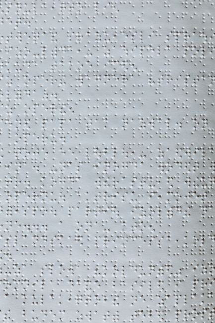
Embossing presses a design up from beneath the substrate so it sits raised above the surface; debossing presses it down from above so it sits recessed. Both use a matched male-and-female metal die set and heat/pressure rather than ink — the choice between them is a design decision (raised and eye-catching vs. sunken and understated), not a cost decision, since setup costs for the dies are similar.
How Each Process Actually Works
Both techniques start the same way: a custom die is engraved with your logo or pattern, typically from magnesium, copper, or brass, with a matching counter-die cut to the inverse shape. The substrate is sandwiched between the two dies under heat and pressure. For embossing, the die pushes the material upward into the counter-die’s cavity, creating a raised, three-dimensional impression. For debossing, the orientation is reversed so the design is pressed into the surface instead, leaving a recessed impression.
‘Blind’ embossing or debossing means no ink or foil is added — the effect relies purely on the shadow and texture created by the raised or recessed paper. Many premium packages combine the technique with foil stamping (foil emboss), where a metallic foil is applied to the same raised area, adding shine on top of the dimensional effect. Foil stamping itself uses a single die (not a matched pair) since it’s transferring pigment rather than shaping the substrate.
When to Use Embossing vs Debossing
Embossing tends to suit brand marks that need to project outward and catch light at a distance — think a raised logo seal on a cosmetics box or a rigid gift box lid meant to be picked up and handled. It reads as bold and celebratory, which is why it’s common in fragrance, cosmetics, and luxury retail packaging, often paired with foil for extra shine.
Debossing tends to suit brands leaning into a quieter, more restrained aesthetic — minimalist skincare, wellness, or artisanal food packaging where the goal is a tactile, considered feel rather than shine. A debossed logo on uncoated, heavier paperboard often reads as more ‘crafted’ precisely because there’s no ink or foil doing the work.
Neither is objectively ‘more premium’ — the right choice depends on whether your brand language is assertive (emboss) or restrained (deboss), and on the substrate you’re already committed to.
Tips / Common Mistakes
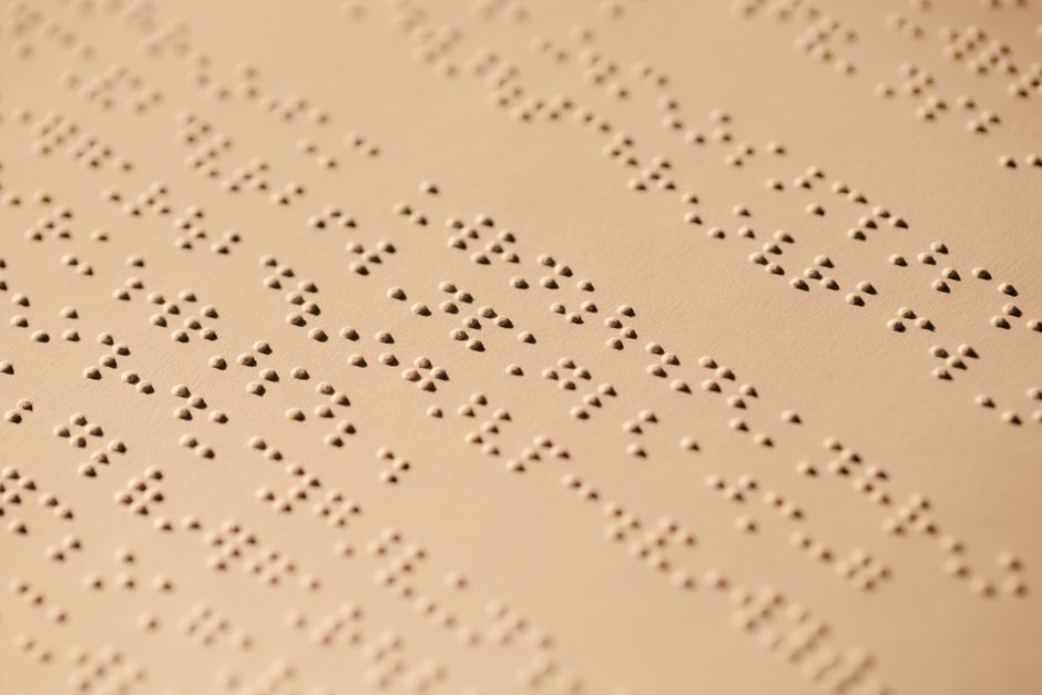
Use vector artwork, not raster, so the die maker can engrave clean edges at any size. Keep logos and type simple — fine serifs, thin script, or intricate detail below roughly 2mm in line width tend to lose definition once pressed, so bolder, simplified marks reproduce far more reliably than a full-detail logo.
Stock matters: paperboard around 300gsm or heavier holds an embossed or debossed impression far better than thin, lightweight stock, which can simply flatten back out over time or during transit. Keep embossed or debossed areas away from folds, scores, and creases — a few millimeters of clearance avoids wrinkling — and away from the very edge of the sheet.
The single most common production headache is registration: getting the die perfectly aligned with any printed artwork underneath it, especially on a multi-color box where the emboss needs to sit exactly inside a printed outline. Always request a physical proof or press sample before committing to a full production run, since a screen mockup can’t show you depth, shadow, or how a debossed mark reads under real store lighting.
Also budget for die setup as a one-time cost — expect it to add meaningfully to a short first run, since it’s the die that’s expensive, not the per-unit pressing. Reordering later with the same die is far cheaper than the first run.
Explore more: More packaging design guides.
Embossing vs Debossing FAQs
Which is more expensive, embossing or debossing?
Roughly the same. Both require a custom matched die set, which is the main cost driver — the difference in per-unit run cost between the two techniques is minimal. Adding foil on top of either one adds a bit more per-unit cost because of the foil material itself.
Can embossing and debossing be combined with printing or foil?
Yes. A blind emboss or deboss (no color) can sit alongside separately printed artwork, or be combined directly with foil stamping in the same die area — often called foil emboss — for a raised, metallic effect.
What kind of paper or board works best?
Heavier, uncoated or lightly coated paperboard (generally 300gsm and up) holds the impression best. Very thin or highly coated stock can crack, flatten, or fail to hold the shape after pressing.
Does embossing or debossing work on materials other than paperboard?
It’s most common on paperboard, folding cartons, and rigid boxes, but the same die-and-pressure principle is also used on leather, some plastics, and rigid box wraps — the achievable depth and detail vary by material.
Source Smarter With Packaura Direct
Find packaging suppliers, surplus inventory, and certification — all on Packaura Direct. Try Packaura Direct.
Photo by Heather Green on Pexels.