
Every package has two audiences: the shopper deciding whether to pick it up, and the scanner at checkout that needs to read it instantly. When a barcode is too small, printed over a seam, or oriented the wrong way on a curved can, it fails to scan — and that’s a returned shipment or an angry retailer, not just a design nitpick.
This guide walks through where barcodes and required regulatory text actually need to live on your packaging, how much space to reserve for them, and how to work those requirements into a design instead of bolting them on as an afterthought.
Quick Answer
Reserve a high-contrast rectangle for your barcode — with clear white space (a “quiet zone”) on both sides — on a panel that won’t be creased or taped over. If that panel is curved, like a can or bottle, favor “ladder” orientation: rotate the symbol so it’s scanned top-to-bottom along the container’s straight vertical axis instead of left-to-right around the curve, which keeps both ends of the symbol in view at once. Keep required regulatory text (net quantity, ingredients, country of origin, warnings) grouped together on the principal display panel or an adjoining panel, in a type size that stays legible at your smallest SKU size, and design your artwork around those fixed zones rather than squeezing them in last.
Where the Barcode Needs to Go — and Why Size and Placement Matter
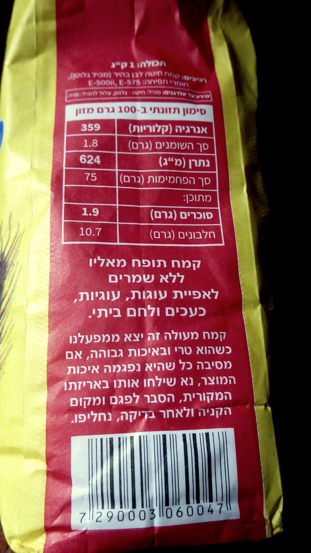
A barcode is only as good as its quiet zone — the blank margin of empty space on either side of the bars that tells a scanner where the code starts and stops. For a standard UPC-A barcode, GS1 specifies a quiet zone of at least nine times the width of the narrowest bar (the “X-dimension”) on both sides, so a barcode crammed right up against a border, logo, or fold line is one of the most common reasons scans fail at retail.
Barcodes also have a usable size range, not just a minimum. GS1 (the organization that issues UPC/EAN numbers and barcode specs) defines a magnification range of roughly 80% to 200% of nominal size for UPC-A/EAN-13 symbols, with the upper half of that range recommended when the barcode will be scanned by automated, high-speed equipment rather than a handheld store scanner. Shrinking a barcode below about 80% to fit a small package is a common mistake that produces a code too fine for most scanners to read reliably.
Placement matters as much as size. Avoid printing a barcode across a seam, fold, or shrink-wrap overlap, since any distortion in the bars can make the symbol unreadable. Curved surfaces like cans and bottles are not off-limits — GS1 explicitly allows barcodes on curved packaging — but they do need the right orientation. The default upright layout (bars standing vertical, scanned left-to-right) is called “picket fence” orientation; wrapped around a tight curve, it can put the two ends of the symbol out of the scanner’s view at the same time, since the surface curves away on both sides of the sweep. “Ladder” orientation avoids that problem: the symbol is rotated so it’s read top-to-bottom along the can’s straight vertical axis rather than around the circumference, which keeps the whole symbol in a flat plane relative to the scan line. GS1 guidance also limits how tightly a symbol can wrap in picket-fence orientation on a curve, so on a narrow cylinder you may need ladder orientation, a smaller symbol, or a different aspect ratio rather than assuming any curved spot will scan the same as a flat one.
Contrast is non-negotiable: dark bars on a light background scan reliably, while light-on-dark, low-contrast color combos, or bars printed over a busy background pattern frequently fail. Red tones are especially risky because many laser scanners struggle to distinguish red from the white background. Stick to black or a dark neutral bar color on white or a light solid background, and proof a sample at actual print size with a barcode verifier or a phone scanning app before finalizing art.
Working Regulatory Text Into the Layout
In the U.S., the Fair Packaging and Labeling Act requires a net quantity statement (weight, volume, or count) to appear on the principal display panel — the panel most likely to be seen at the point of sale — as its own distinct line, set apart from other text and graphics by a minimum amount of surrounding white space. That means you can’t let a tagline or logo crowd right up against it; building in a dedicated clear zone for the net quantity statement from the start of the layout avoids a late-stage scramble to shrink other elements.
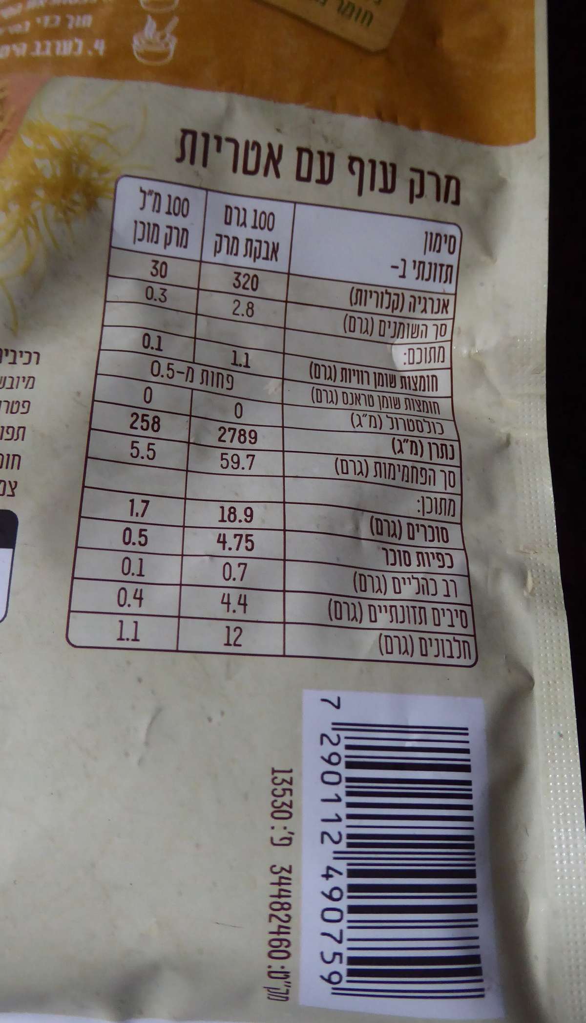
Depending on your product category, other required elements — ingredient or materials lists, country-of-origin marking, manufacturer or distributor name and address, care or safety warnings, and (for food, supplements, or cosmetics) nutrition or ingredient panels — typically live on a secondary panel rather than the main display face. Group these together in one labeling block rather than scattering them, since regulations generally require related mandatory text to appear together and in a consistent, legible type size and style across your product line.
Treat the barcode and the regulatory text block as a single reserved zone in your layout, not two separate afterthoughts. Many brands put both on the same back or bottom panel: barcode on one side, required text stacked on the other, with your quiet zone and minimum text size locked in before any decorative art is placed. That way redesigns, new flavors, or size variants can reuse the same template without re-solving the compliance puzzle each time.
If you sell internationally, check destination-specific rules early — the EU, Canada, and other markets have their own mandatory label content (bilingual text in Canada, specific symbols or declarations in the EU) that can change how much space the compliance block needs. It’s far cheaper to find this out at the design stage than after a print run is rejected at customs.
Tips / Common Mistakes
Don’t let the barcode shrink along with the package. If you’re adapting one artwork file across multiple package sizes, resize the barcode independently and verify it stays within the recommended magnification range rather than letting it scale down proportionally with a shrinking panel.
On cylindrical packaging, check orientation before you check size. A barcode in the default picket-fence layout can fail on a tight curve where the same symbol in ladder orientation — rotated to read along the can’s straight vertical axis — would scan fine, so rotating the symbol is often the fix, not resizing it.
Avoid printing the barcode over foil, high-gloss laminate, or textured stock without testing first — glare and uneven surfaces are a frequent cause of scan failures that never show up until the product is on a shelf.
Leave the compliance block alone when a new design refresh happens. It’s easy to accidentally nudge a net quantity statement too close to new artwork during a rebrand; re-check the required spacing every time the layout changes, not just on the first approval.
Get a physical proof scanned with real retail equipment (or at minimum a barcode verification tool) before a full print run — a barcode that looks fine on screen or even on a laser printer can fail at production print resolution.
Explore more: More packaging design guides.
Frequently Asked Questions
How much white space does a barcode need around it?
For a UPC-A barcode, GS1 specifies a quiet zone of at least nine times the width of the barcode’s narrowest bar on both the left and right sides, with no text, graphics, or borders inside that zone.
Can I put a barcode on a curved surface like a can or bottle?
Yes — GS1 explicitly permits curved-surface placement; it’s not a scan-failure risk by default. On tighter curves, use “ladder” orientation, which rotates the symbol so it’s scanned top-to-bottom along the container’s straight vertical axis instead of around the circumference. The default upright “picket fence” layout, scanned around the curve, is better suited to flat or gently curved panels, since a tight curve can put both ends of the symbol out of the scanner’s view at once.
What’s the smallest I can print a barcode?
GS1 guidance puts the usable range at about 80% to 200% of a UPC/EAN symbol’s nominal size. Going below that risks bars too fine for standard scanners to read reliably.
Do all products need a net quantity statement?
In the U.S., consumer commodities covered by the Fair Packaging and Labeling Act need one on the principal display panel. Requirements and exemptions vary by product category, so check the rules that apply to your specific product type.
Find the Right Packaging Supplier
Search the free Packaura supplier directory — filter by material, certification, and location to find vetted suppliers. Search the Supplier Directory.
Want packaging news in your inbox? Subscribe to the free newsletter.
Photo: Chenspec / CC BY-SA 4.0, via Wikimedia Commons.