
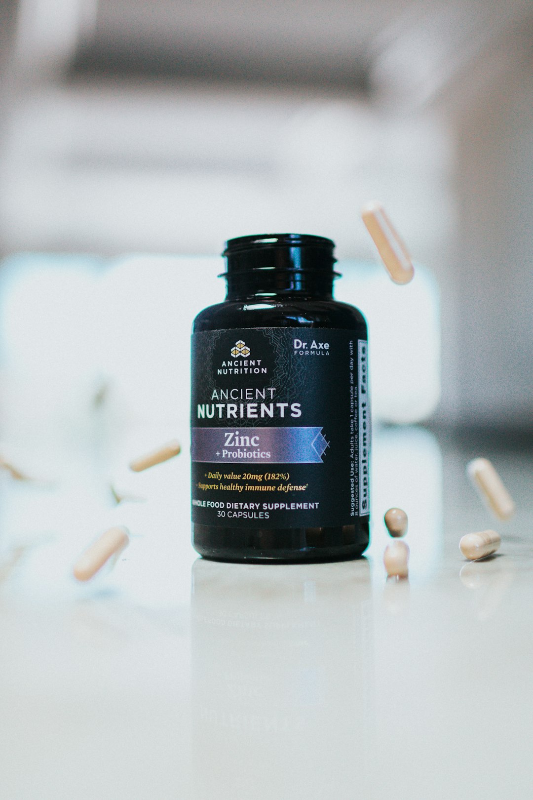
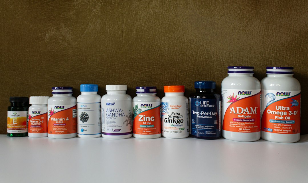
Shoppers decide whether a supplement looks legitimate in the few seconds it takes to glance at the bottle. Before anyone reads a single ingredient, they’re reacting to whether the label looks organized, honest, and professionally made — or cluttered, exaggerated, and cheap.
This guide covers the two layers that make a supplement label trustworthy: the FDA-required elements that signal a product is properly regulated, and the design choices — hierarchy, whitespace, typography, color, and claims language — that make a compliant label actually feel credible on the shelf.
Quick Answer
A trustworthy supplement label combines every FDA-mandated element (a clear Supplement Facts panel, full ingredient list, net quantity, manufacturer contact info, and required disclaimers) with clean design fundamentals: strong visual hierarchy, generous whitespace, legible typography, and claims language that sounds measured rather than miraculous.
The FDA-Required Elements That Signal Legitimacy
Every dietary supplement label needs a specific set of elements: a statement of identity (what the product is), the net quantity of contents, a Supplement Facts panel, a complete ingredient list, the name and place of business of the manufacturer, packer, or distributor, a domestic address or phone number for reporting adverse events, and any required allergen declarations. As of 2026, sesame joins the eight major allergens already covered under U.S. law, so labels containing it need a clear ingredient listing or ‘Contains’ statement.
Inside the Supplement Facts panel itself, the FDA requires the title ‘Supplement Facts’ to be bold and larger than any other text on the panel, spanning its full width whenever practical. Serving size and servings per container must be listed, along with the amount per serving of each dietary ingredient. Botanical ingredients must state the plant part used (root, leaf, extract, etc.), and proprietary blends must show the total blend weight per serving with individual ingredients listed in descending order by amount.
Getting these details right isn’t just about avoiding a warning letter — shoppers who know what to look for (or who scan with a label-checking app) will notice when a panel is missing information, and that’s an instant credibility hit. When these elements are present, correctly formatted, and easy to find, they function as a silent ‘this is a real, regulated product’ signal.
Design Choices That Build Trust Beyond Compliance
Compliance gets you a legal label. Design gets you a label people believe. Visual hierarchy is the first lever: the product name, primary benefit, and dosage should be immediately scannable, with supporting details (certifications, secondary ingredients, brand story) visually secondary. A label where everything competes for attention at the same size reads as amateur, regardless of what’s actually inside the bottle.
Whitespace matters more on a supplement label than almost any other packaging category, because cluttered layouts subconsciously read as ‘trying to hide something’ or ‘crammed in by someone who doesn’t know what they’re doing.’ Leaving breathing room around the Supplement Facts panel and brand mark signals confidence in the product.
Typography and color carry emotional weight before anyone reads a word. Clean, legible sans-serif fonts for facts and dosage information (never anything decorative or hard to scan) pair well with a restrained color palette — muted blues and greens tend to read as clinical and calming, which fits wellness and sleep categories, while brighter accent colors can work for energy or performance products as long as they don’t overwhelm the compliance text.
Claims language is where trust is won or lost fastest. Structure/function claims (‘supports immune health’) are allowed without pre-approval, but they legally require the standard disclaimer: ‘This statement has not been evaluated by the Food and Drug Administration. This product is not intended to diagnose, treat, cure, or prevent any disease.’ Labels that bury this disclaimer in tiny gray text, or that use language bordering on disease claims (‘cures,’ ‘treats,’ ‘reverses’), raise red flags with both regulators and skeptical shoppers. Measured, specific claims paired with a clearly visible disclaimer read as more credible than bold promises.
Tips and Common Mistakes
Print the expiration date, lot/batch code, and storage instructions somewhere easy to find — these details signal quality control and give customers confidence the product is fresh and traceable. If the product is third-party tested (NSF, USP, or an independent lab), display that mark clearly rather than mentioning it only in fine print.
Common mistakes to avoid: shrinking facts-panel text below the FDA’s minimums (standard packages need at least 8-point type; smaller type is only allowed as package size shrinks, and the smallest permitted size, 4.5-point, is reserved for packages with less than 12 square inches of available labeling space), inconsistent branding between the front label and Supplement Facts panel, ingredient lists that don’t match what’s declared in the panel, and claims that outrun what the product can legally say. Also avoid overcrowding the front panel with badges and callouts — three or four well-chosen trust marks (certifications, ‘made in’ claims, third-party testing) outperform a dozen competing for attention.
Finally, test the label at actual bottle size before finalizing. Text that looks fine on a full-screen mockup can become unreadable when wrapped around a small cylindrical bottle, and illegible dosage information undermines trust just as much as a missing disclaimer.
Explore more: More packaging design guides.
Supplement bottle label design FAQs
What are the legally required elements on a supplement label?
A statement of identity, net quantity of contents, a Supplement Facts panel, a complete ingredient list, the manufacturer/packer/distributor’s name and address, a domestic contact for adverse event reports, and applicable allergen declarations.
Do supplement labels need the FDA disclaimer?
Yes — any structure/function claim (like ‘supports joint health’) must be accompanied by the standard disclaimer stating the claim hasn’t been evaluated by the FDA and the product isn’t intended to diagnose, treat, cure, or prevent disease.
What design choices make a supplement label look more trustworthy?
Clear visual hierarchy, generous whitespace, legible typography for dosage and facts information, a restrained color palette matched to the product’s category, and visible (not buried) certification marks and required disclaimers.
Find the Right Packaging Supplier
Search the free Packaura supplier directory — filter by material, certification, and location to find vetted suppliers. Search the Supplier Directory.
Want packaging news in your inbox? Subscribe to the free newsletter.
Photo: Unknown / CC BY 4.0, via Wikimedia Commons.