
Minimalist packaging looks easy to pull off until you try it. Strip away too little and the box still feels busy; strip away too much and shoppers can’t tell what’s inside or why it costs what it does. The brands that get it right aren’t doing “less work” — they’re making sharper decisions about what actually needs to be on the package and cutting everything else.
This guide walks through the core principles of minimalist packaging design, a practical process for applying them, and the compliance and production details that trip up even experienced designers when a package goes from clean concept to something that has to survive a warehouse, a shelf, and a regulator’s checklist.
Quick Answer
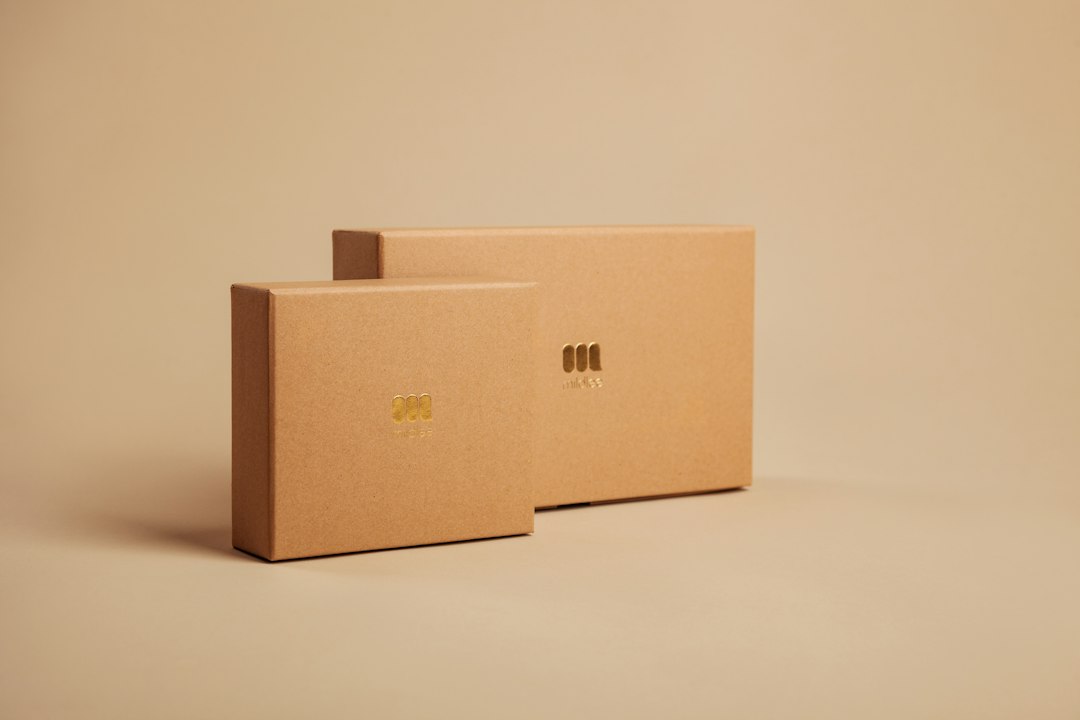
Minimalist packaging design means reducing a package to its essential elements — one or two colors, a single strong typeface, generous white space, and honest material choices — so the product name, brand, and purpose read instantly without decorative noise competing for attention.
The Core Elements of a Minimalist Package
Color is usually the first thing to simplify. A restrained palette — often a single brand color plus a neutral like white, black, or unbleached kraft — reads as deliberate rather than cheap, as long as the contrast is strong enough to stay legible at a glance.
Typography carries more weight when there’s less else on the package. Most minimalist designs lean on one primary typeface for the product name and a second, quieter one for supporting copy, with size and weight used to create hierarchy instead of extra colors or graphics.
White space (or negative space) isn’t empty — it’s what makes the remaining elements feel intentional. Resist the urge to fill a blank panel just because it’s blank; an underused panel is often the whole point.
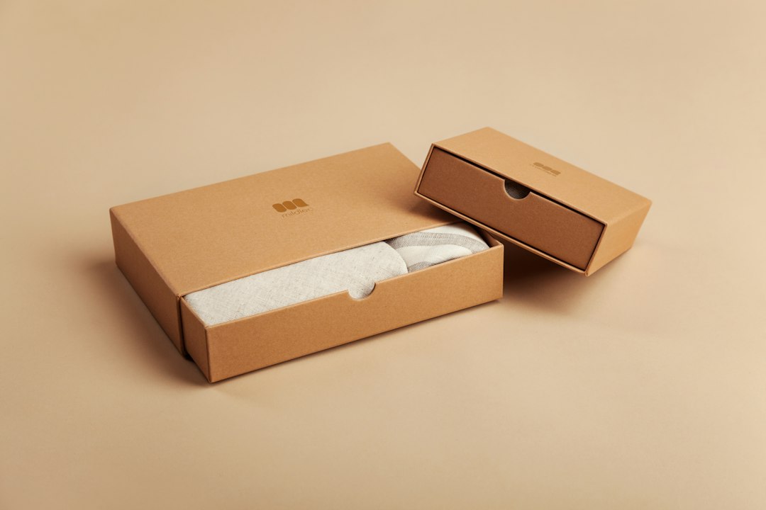
Material and finish do a lot of the talking when imagery is stripped away. Uncoated kraft stock, visible cotton texture, a subtle embossed logo, or a matte finish can communicate quality and values (like sustainability) more convincingly than printed claims.
A Practical Process for Designing It
Start by listing everything that legally or functionally must appear on the package — product name, net quantity, ingredients or materials, manufacturer info, barcode, any required warnings. This becomes your non-negotiable content, and minimalism is about organizing it cleanly, not deleting it.
Next, rank that content by importance to the shopper: what needs to be readable from three feet away versus what only needs to be findable once someone picks the package up. Give the top one or two items the most visual weight and push the rest to a secondary panel.
Sketch in grayscale before adding color. If the layout works in black and white — if hierarchy and balance hold up without color to prop them up — the design is doing real work rather than relying on decoration.
Prototype at actual size and in the actual material before finalizing. A label that looks balanced on a screen can feel cramped or oddly empty on a real bottle, pouch, or box, especially once structural elements like seams, closures, or die-cut windows are factored in.
Tips and Common Mistakes
Don’t confuse “minimal” with “blank.” A package with no visible brand name or product category isn’t minimalist, it’s just unmarked — shoppers still need to know what they’re looking at within a second or two.
Check legibility under real conditions: store lighting, small thumbnail sizes for e-commerce, and from an arm’s length away, not just zoomed in on a design monitor.
Don’t let minimalism override required label information. Regulations like the U.S. Fair Packaging and Labeling Act and FDA labeling rules set legibility and placement standards for things like net quantity and ingredient statements — a beautifully clean layout that buries or shrinks required text can get a product pulled from shelves or flagged by retailers.
Test against competitors on the actual shelf or search results page, not in isolation. A quiet, minimal design can look premium next to cluttered competitors or can simply disappear next to them — know which effect you’re going for.
Watch structural costs. Fewer printed colors and simpler graphics can lower print costs, but premium substrates (heavier stock, embossing, soft-touch coatings) that minimalist design often leans on can offset those savings, so get a few supplier quotes before locking the concept.
Explore more: More packaging design guides.
Minimalist packaging design FAQs
Does minimalist packaging cost less to produce?
It can, since fewer ink colors and simpler artwork typically reduce print setup costs. But many minimalist designs use higher-quality materials or special finishes (embossing, uncoated stock, soft-touch coatings) to carry the visual weight that color and imagery used to provide, which can offset or exceed those savings. Get quotes before assuming it’s cheaper.
Will minimalist packaging stand out on a crowded shelf?
It depends on the category. In categories full of busy, colorful competitors, a quiet design can stand out by contrast. In categories where most competitors are already minimal, you may need a distinct color, shape, or material to avoid blending in rather than standing out.
What’s the biggest mistake brands make with minimalist packaging?
Treating minimalism as removing elements rather than organizing them. The goal is a clear hierarchy of what matters most, not an empty package — if a shopper can’t quickly identify the product and brand, the design has gone past minimal into unclear.
Find the Right Packaging Supplier
Search the free Packaura supplier directory — filter by material, certification, and location to find vetted suppliers. Search the Supplier Directory.
Want packaging news in your inbox? Subscribe to the free newsletter.
Photo by Mildlee on Unsplash.