
A limited-edition can or box is supposed to grab attention on a crowded shelf, but the moment it stops looking like your brand, it stops working for your brand. The challenge every brand or packaging team runs into around the holidays, a product launch, or a seasonal flavor drop is the same: how do you make something feel new and exciting without making it feel like a different company made it.
This guide walks through a practical system for designing seasonal and limited-edition packaging that stays recognizable at a glance, plus the specific mistakes that cause brands to lose that recognition right when they need it most.
Quick Answer
Lock a small set of core brand elements (logo lockup, primary color, typography, and layout structure) so they appear on every seasonal variant unchanged, then use a limited, pre-approved set of ‘flex’ elements — color accents, patterns, seasonal graphics, finishes — to create the special-edition feel. Consistency comes from what never changes; excitement comes from what’s allowed to change inside those guardrails.
Build a ‘Locked vs. Flexible’ Element List
Before any seasonal design work starts, split your packaging system into two lists. The locked list holds whatever makes your product instantly identifiable from a few feet away — usually the logo and its minimum clear space, one or two primary brand colors, the core typeface, and the basic layout structure (where the logo sits, where the product name sits, where any mandatory label copy goes). These elements should look the same on the seasonal version as they do on the everyday version.
The flexible list holds everything designers are free to change for a seasonal or limited run: a secondary accent color, a background pattern or illustration, a seasonal tagline, foil or texture finishes, and sometimes the can or label shape itself if the base packaging allows it. Writing both lists down and sharing them with every designer, agency, or co-packer who touches packaging is what actually prevents drift — without a written list, ‘seasonal’ quietly becomes ‘off-brand’ one release at a time.
Bud Light’s limited-edition cans are a good real-world example of this split in action: the turquoise logo lockup and basic can layout stay fixed across every variant, while the background color, team or partner graphic, and supporting copy change completely from can to can. A shopper who doesn’t care about the seasonal theme still reads the can as Bud Light at a glance.
Design the Seasonal Layer as an Accent, Not a Takeover
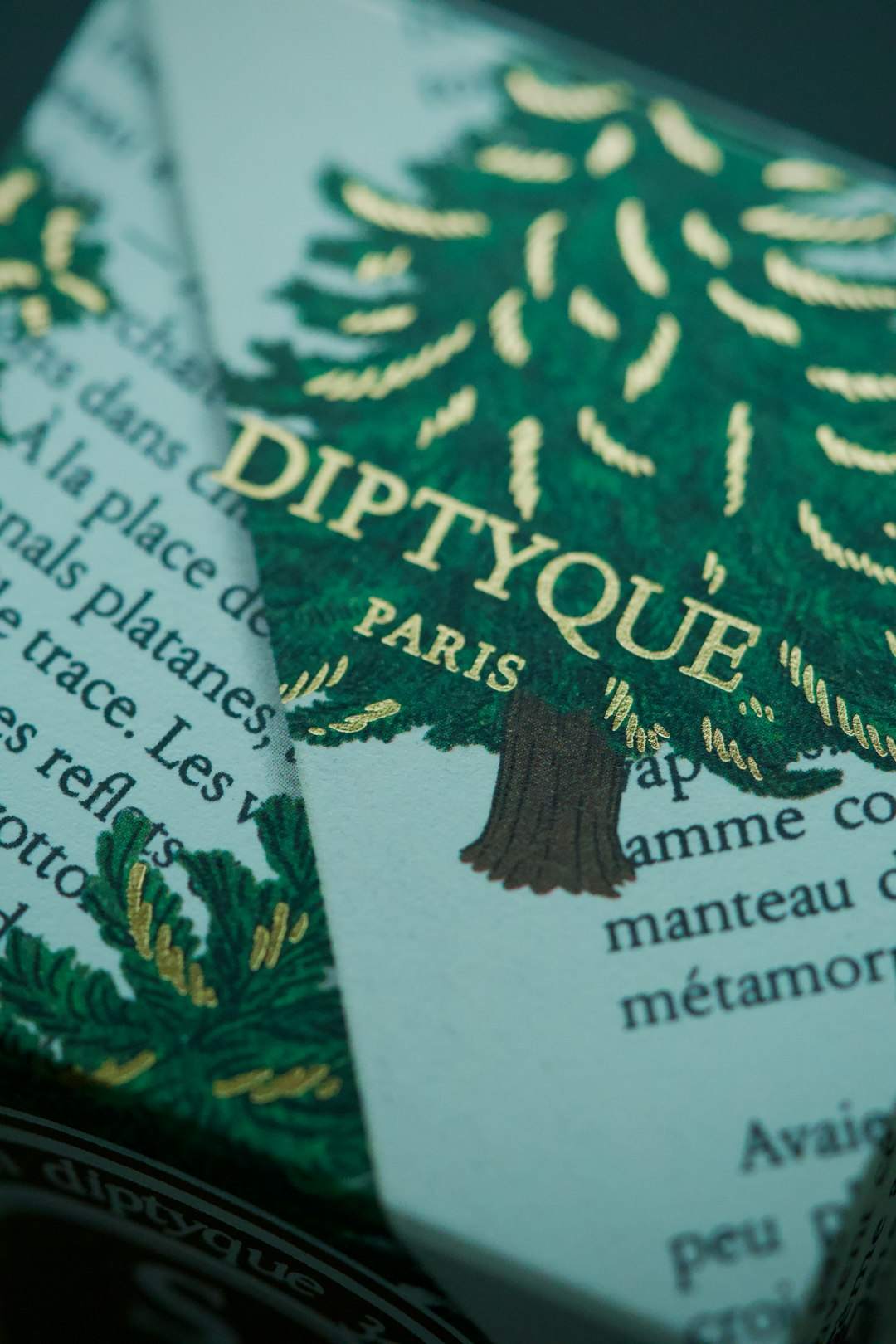
Treat seasonal cues — snowflakes, pumpkins, fireworks, a holiday color palette — as a layer added on top of the brand, not a replacement for it. A metallic foil border, a seasonal color swapped into the background, or a small holiday icon tucked near the logo usually reads as festive and intentional. Replacing the primary brand color entirely, changing the logo’s proportions, or redesigning the layout from scratch usually reads as a different product, which forces returning customers to re-find you on shelf.
Keep the seasonal treatment proportional to how recognizable your packaging already is. A brand with strong, well-known shelf presence can push further into seasonal styling and still be found. A newer or less established brand should lean more conservative, since it hasn’t banked enough recognition to survive a big visual swing.
Match the mood of the seasonal design to the brand’s actual positioning. A premium or minimalist brand generally looks wrong wrapped in cartoonish holiday graphics — a sleek metallic accent or a restrained seasonal color shift fits better than snowmen and glitter. A playful, mass-market brand can go bolder without it feeling off.
Tips / Common Mistakes
Skipping a shelf test is the most common mistake: mock up the seasonal design next to your regular packaging and your competitors’ seasonal packaging, then step back several feet. If the seasonal version doesn’t register as ‘yours’ at a glance, pull back on how much changed.
Another frequent issue is letting every seasonal SKU invent its own rules instead of pulling from the same locked/flexible list, which is how a product line ends up with five limited editions that don’t look related to each other or to the core product. Keep one seasonal design brief that every variant references.
Watch required label information too — nutrition facts, net weight, ingredient lists, and any regulatory callouts still have to meet the same placement and legibility rules as your standard packaging, even when the background art changes. A festive redesign is not an excuse to shrink or bury mandatory copy.
Finally, plan the production side before finalizing the art. Short-run seasonal packaging often means smaller print quantities, tighter lead times, and sometimes a different printing process (digital or variable-data printing instead of the long-run method used for core SKUs), so loop in your printer or co-packer early about finish, substrate, and minimum order quantities rather than after the design is locked.
Explore more: More packaging design guides.
Limited-edition seasonal packaging design FAQs
How different can limited-edition packaging look before it hurts brand recognition?
There’s no fixed percentage, but the safest approach is to keep your logo lockup, primary brand color, and layout structure unchanged while varying secondary colors, patterns, and graphics. If a customer who knows your regular packaging can still identify the brand at a glance, the seasonal version is close enough.
Should every seasonal release use the same template?
Yes, in the sense that every release should pull from one documented list of locked and flexible elements. The specific colors or graphics can change each season, but the system deciding what’s allowed to change should stay the same across releases.
Does seasonal packaging need to go through the same compliance checks as regular packaging?
Yes. Required label elements like net weight, ingredients, nutrition information, and any regulatory warnings still have to appear and remain legible, regardless of how the surrounding art changes for the season.
Is seasonal packaging worth it for a small brand?
It can be, if it’s scoped to what you can actually execute — even a single accent color swap or a seasonal sleeve over existing packaging can create a limited-edition feel without the cost or risk of a full redesign.
Find the Right Packaging Supplier
Search the free Packaura supplier directory — filter by material, certification, and location to find vetted suppliers. Search the Supplier Directory.
Want packaging news in your inbox? Subscribe to the free newsletter.
Photo by Invisible on Unsplash.