Packaging typography carries the weight of brand voice, regulatory compliance, and shelf legibility in milliseconds of consumer attention. The right typeface choice signals premium positioning, supports accessibility for older shoppers, and communicates ingredient information clearly enough to satisfy FDA labeling requirements. This guide breaks down the typography fundamentals, regulatory constraints, and design system principles that define packaging type decisions.
Legibility and Minimum Type Sizes
FDA food labeling regulations require nutrition facts text at minimum 8-point type for most products, with allergen statements often emphasized through bold treatment or larger size. Packaging typography for ingredient lists and warnings must remain legible to consumers across age ranges, with research showing 10-12 point as the threshold for comfortable older-adult reading.
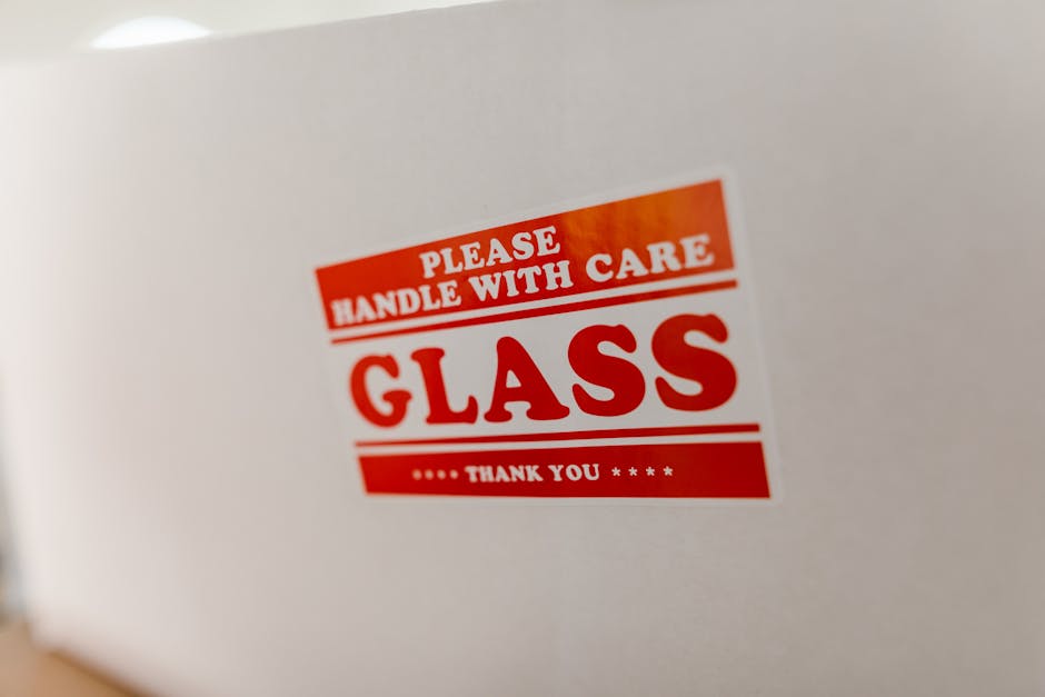
For warnings on cleaning products, OTC pharmaceuticals, and child-facing products, regulatory minimums climb to 1/16 inch (4.5 point) or larger depending on jurisdiction. FDA food labeling guidance details typography requirements that apply across food categories.
Brand Type Hierarchy and Architecture
Effective packaging typography establishes clear hierarchy: brand name (largest, most distinctive), product descriptor (secondary emphasis), variant identification (tertiary but clear), supporting copy (smallest legible). Type families with multiple weights and widths support hierarchy without introducing competing typefaces.
For multi-SKU portfolios, establishing a type system that scales from premium tiers to value tiers maintains brand cohesion while enabling differentiation. Our packaging design trends 2026 coverage details how typography is evolving across luxury and mass-market categories.
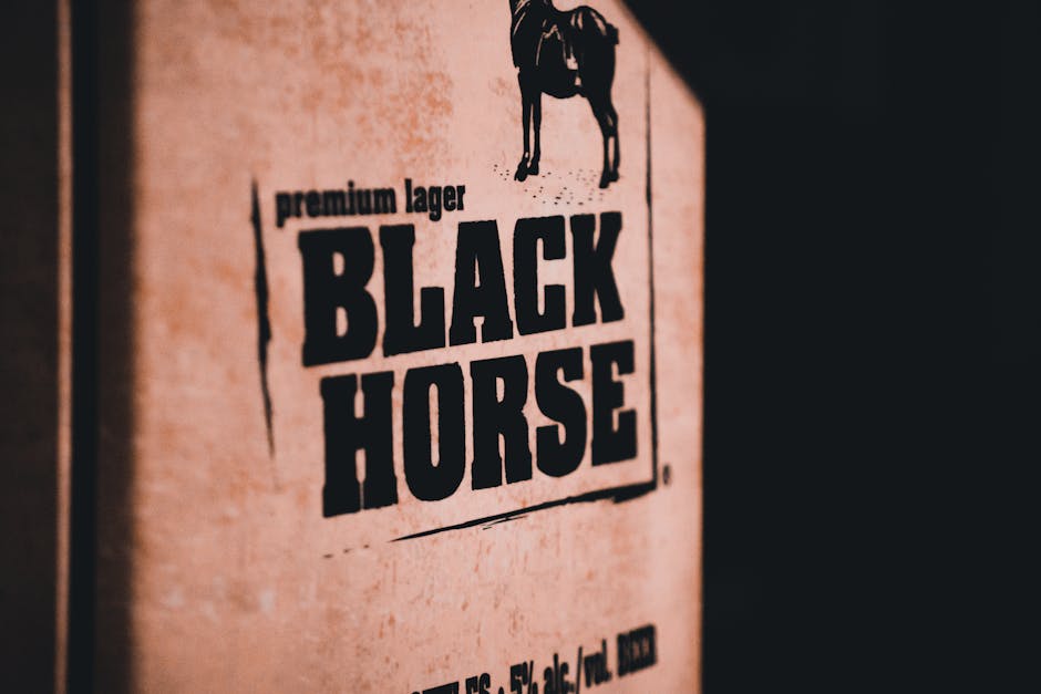
Serif vs. Sans-Serif Category Conventions
Serif typefaces traditionally communicate heritage, craftsmanship, and premium positioning — common in wine, spirits, premium chocolate, and traditional grocery categories. Sans-serif typefaces signal modernity, technology, and accessibility — dominant in personal care, wellness, and challenger brands.
Recent design trends blur these boundaries, with luxury brands adopting bold sans-serifs (Aesop, Glossier) and mass-market brands using serifs for authenticity messaging (Honest Company, Hu Chocolate). Packaging Dive tracks typography trends across CPG categories.
Custom Typefaces and Brand Investment
Major brands increasingly commission custom typefaces from foundries like Commercial Type, Klim Type Foundry, and Frere-Jones to lock in distinctive visual identity. Custom faces cost $50,000-$300,000 to develop but provide proprietary brand assets that competitors cannot replicate.
For brands without custom typeface budget, careful selection from licensed type families with strong character (Founders Grotesk, Domaine Display, Söhne) provides distinctive options. License terms must cover packaging usage rights — many web-only licenses don’t extend to packaging applications.
Color, Contrast, and Accessibility
Typography legibility depends as much on color contrast as size. WCAG accessibility standards recommend 4.5:1 contrast ratio for body text, scaling higher for smaller type. Light text on photographic backgrounds requires careful management to maintain legibility.
For packaging targeting older consumers, accessibility-focused brands, or vision-impaired consumers, conservative contrast and larger type sizes support brand inclusivity. Pair these typography decisions with the broader design framework in our color psychology packaging design guide to align type, color, and brand identity systematically.
Frequently Asked Questions
What minimum type size does FDA require for nutrition facts?
FDA requires nutrition facts text at minimum 8-point type for most packages, with smaller minimums for very small packages and larger requirements for some elements.
When should brands invest in a custom typeface?
Brands with $50,000+ budgets and long-term identity goals benefit from custom typefaces. Smaller brands typically license distinctive typefaces from established foundries.
Are serifs always premium and sans-serifs always modern?
These conventions are blurring. Luxury brands increasingly use bold sans-serifs while mass-market challengers adopt serifs for authenticity and craft positioning.
What contrast ratio supports packaging accessibility?
WCAG accessibility standards recommend 4.5:1 contrast ratio for body text, with higher ratios for small type and lower thresholds for large display type.
Do packaging typefaces require special licensing?
Yes, many typeface licenses cover only specific use cases (web, print, app). Verify packaging usage rights before deploying licensed faces across global packaging.