
A subscription box only gets one chance a month to remind a customer why they signed up. The product inside matters, but the moment of opening the box is where retention is won or lost — it’s the closest thing a mail-order brand has to a storefront.
This guide breaks down what actually makes an unboxing experience worth sharing: how to structure the reveal, which materials and printing choices carry the most impact for the money, and the mistakes that quietly undercut an otherwise good design.
Quick Answer
Great subscription box packaging design combines a distinctive exterior (color, logo placement, mailer shape), a layered interior reveal (tissue paper, inserts, or dividers that delay gratification), and a few personal touches (a note, a themed graphic, a hint of what’s inside) — all built around a consistent color and typography system so every box is instantly recognizable before it’s even opened.
Build the Unboxing Sequence Step by Step
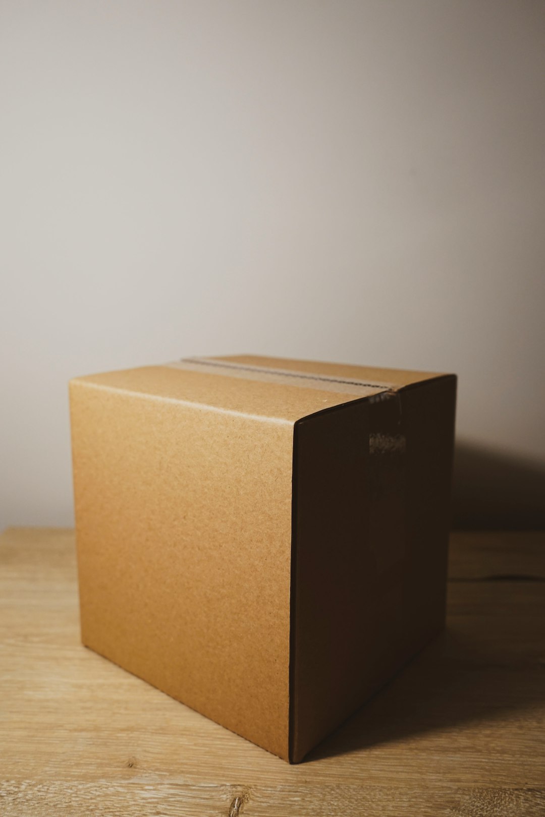
Start with the exterior. This is the first brand touchpoint, often before a customer even opens the box — it shows up in a hallway, on a porch, in an office mailroom. A custom mailer with a printed logo, a signature color, or a distinctive box shape (rather than a plain shipping carton) signals that something considered is inside. Matte finishes tend to read as premium; glossy or spot-UV accents draw the eye to a logo or tagline.
Design the opening ritual next. The best subscription boxes don’t dump everything on the customer at once — they reveal it in layers. A common structure is: outer box, then a printed or branded tissue wrap, then a top card or insert (often the first thing seen after the flaps open), then the products themselves, arranged so the hero item is visible first. Dividers, trays, or crinkle fill can also control the order things are noticed.
Don’t ignore the inside of the box itself. Printing on the interior flaps or base — a pattern, a quote, a ‘welcome’ message — is one of the highest-impact, lowest-cost upgrades, since it’s visible in nearly every unboxing photo or video without adding a separate component.
Add a personal or seasonal layer. A short thank-you card, a themed insert tied to that month’s contents, or a small info card explaining what’s inside (and why) helps the box feel curated rather than shipped. For brands with the infrastructure, variable printing (a subscriber’s name, a personalized note) pushes this further, though it’s not necessary for a strong result.
Finish with a call to action. A card that nudges the customer to share, tag the brand, or scan a QR code for styling tips or a referral link turns a good unboxing into free social content — but only if the box already looks worth photographing.
Choosing Materials, Printing, and a Budget That Makes Sense
Match the packaging tier to the product tier. A $15/month box and a $150/month box shouldn’t use the same corrugate weight or print technique — customers calibrate perceived value partly from how the box feels in hand. For mid-market and premium boxes, rigid or double-wall mailers, soft-touch coatings, and foil or embossed logos are common upgrades; for budget-friendly boxes, a well-designed single-color print on kraft stock can still look intentional if the layout and typography are strong.
Sustainable materials are now close to a baseline expectation rather than a differentiator for a meaningful share of subscribers, so it’s worth treating them as a design constraint from the start rather than an afterthought. FSC-certified corrugated boxes, recycled-content mailers, kraft or recycled tissue paper, soy or water-based inks, and paper-based void fill (instead of plastic air pillows) are widely available from most packaging suppliers and print shops without a major cost premium.
Budget for the extras deliberately. Interior printing, branded tissue paper, and custom inserts each add a modest amount to per-shipment cost — small on their own, but additive across several elements, so most brands pick two or three high-impact touches (branded tissue plus an interior print, for example) rather than adding every option available.
Test the box empty and full before committing to a print run. Check that inserts don’t shift during transit, that tissue paper doesn’t obscure a printed message, and that the box survives a real shipping cycle — a beautiful design that arrives crushed undoes the work.
Tips and Common Mistakes
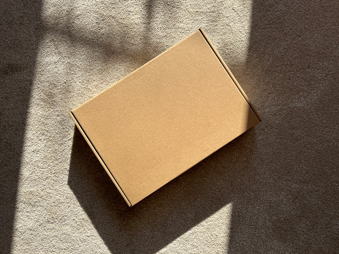
Keep the brand system consistent month to month — same logo placement, same color family, same typography — even as seasonal graphics or themes change, so subscribers recognize the box before reading a label. Design for the photo, not just the shelf: think about how the box looks in a flat-lay or a short unboxing video, since that’s how a large share of subscription box exposure actually happens. Avoid over-layering — three or four thoughtful touches (tissue, an insert, interior print) beat seven components that make the box tedious to open. Don’t let branding crowd out function: inserts and dividers should protect the product first, decorate second. And test with real customers or a small focus group before a full print run — what looks good in a mockup doesn’t always feel right in hand.
Explore more: More packaging design guides.
Subscription box packaging design FAQs
What makes subscription box packaging ‘worth sharing’ on social media?
A layered reveal (tissue, inserts, then product), a visually distinct exterior, and interior printing all increase the chance a customer photographs or films the unboxing. Boxes that look intentional and considered, rather than purely functional, get shared far more often.
How much should I budget for premium packaging touches?
It varies by supplier and materials, but interior printing, branded tissue paper, and custom inserts typically add a modest amount per shipment on top of base packaging costs. Start with one or two high-impact touches and expand once you see the effect on retention or social mentions.
Is sustainable packaging worth it for a small subscription box brand?
Yes — recycled-content mailers, kraft tissue paper, and water-based inks are widely available at competitive prices and are increasingly expected by subscribers, so they’re a reasonable default rather than a premium add-on.
Should every box in a subscription series look identical?
Keep core brand elements (logo, color palette, typography) consistent so the box is instantly recognizable, but let secondary graphics, an insert theme, or seasonal accents change month to month to keep the experience fresh.
Source Smarter With Packaura Direct
Find packaging suppliers, surplus inventory, and certification — all on Packaura Direct. Try Packaura Direct.
Want packaging news in your inbox? Subscribe to the free newsletter.
Photo by Brandable Box on Unsplash.