A shopper decides whether to pick up your product or walk past it in seconds. Before they read a single word, the shape and feel of your typography is already telling a story — premium or affordable, artisanal or clinical, playful or serene. Choosing the right font for your packaging is one of the highest-leverage design decisions you can make.
This guide breaks down the best fonts for packaging design by category — serif, sans-serif, and script — with specific picks suited to food, beauty, and lifestyle brands. You’ll also find practical tips on pairing, sizing, and the licensing detail most designers overlook.
Quick Answer
For luxury beauty, start with Didot or Garamond. For modern skincare and wellness, reach for Helvetica Now, Futura, or Montserrat. For artisanal food brands, Baskerville and Cormorant Garamond signal craft and heritage. For playful or casual products, Pacifico and Bebas Neue add personality. Use no more than three fonts per package, assign one to your brand name, one to product descriptors, and an optional accent, and always test at actual print size before finalizing.
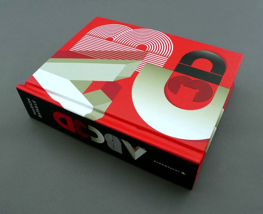
Serif Fonts: Heritage, Luxury, and Craft
Serif fonts carry centuries of cultural weight, and that heritage translates directly into perceived quality on a shelf. Didot is the canonical luxury beauty choice — its sharp, high-contrast strokes communicate glamour and precision. Chanel’s packaging leans on Didot-style type for exactly this reason. If your skincare or fragrance line is positioned at the premium end, Didot is a safe and proven starting point.
Garamond is softer and more literary, with hairline-thin strokes that Lancôme has used to convey refinement. It’s especially well-suited to heritage beauty brands, small-batch food producers, and candlemakers who want to evoke handcraft without looking rustic. Cormorant Garamond shares these qualities with a slightly more editorial feel, making it popular for home fragrance and lifestyle candle packaging.
Baskerville sits between Garamond and Didot — less delicate than Garamond, less stark than Didot. It reads as trustworthy and intelligent, which is why it appears on tea tins, premium chocolate bars, and wellness supplements. Playfair Display is a more contemporary option in this family: its high contrast looks striking on front panels and product labels, and it holds up well when printed on both glossy and uncoated stock.
Sans-Serif Fonts: Clean, Modern, and Versatile
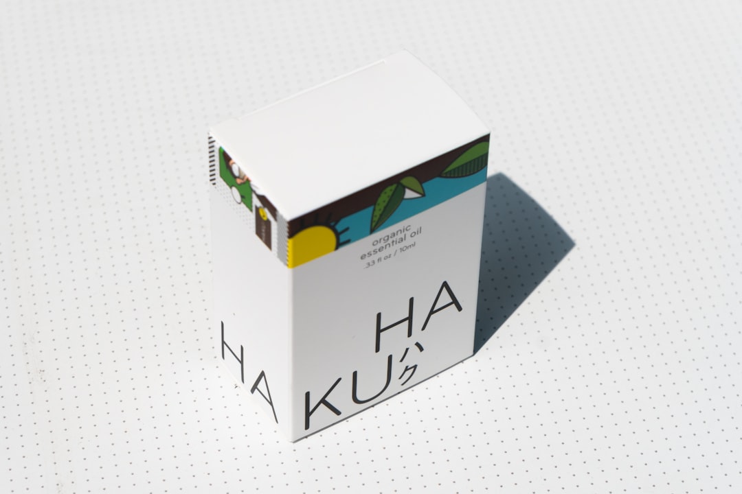
Sans-serif fonts dominate modern skincare, wellness, and lifestyle packaging because they read as accessible, hygienic, and forward-thinking. Helvetica Now — the updated version of the classic Helvetica — is the workhorse here. Its refined spacing and extensive weight range let you handle everything from the brand name down to the ingredient panel within a single type family, which makes packaging cohesion much easier to achieve.
Futura’s geometric construction gives it a confident, slightly architectural feel. Gucci uses it in part of their identity for this reason. On packaging it works particularly well for bold labels, minimalist boxes, and premium gift sets where strong shapes carry the visual. Avenir is Futura’s warmer cousin — it shares the geometric structure but adds humanist touches that make it feel approachable rather than cold, landing it frequently on contemporary food packaging and health-focused lifestyle products.
Montserrat has become a go-to for coffee brands, wellness products, and lifestyle packaging. Its urban signage origins give it a grounded, friendly quality — structured enough to read as professional, casual enough to avoid stuffiness. For maximum versatility on bottles and boxes, Proxima Nova’s extensive family and clear letterforms make it easy to deploy across multiple packaging formats within a single product line.
Script and Display Fonts: Personality and Storytelling
Script fonts introduce warmth, handcraft, and emotion — qualities that resonate with artisanal food brands, natural beauty lines, and indie lifestyle products. Great Vibes is flowing and romantic, ideal for limited-edition releases, candle labels, or gift tag accents. SignPainter leans into retro market signage energy, making it a strong choice for food packaging that wants a farmers-market-fresh, vintage-diner aesthetic. Use scripts primarily for product names or accents; pairing them with a clean sans-serif for body copy keeps readability intact.
On the display side, Pacifico’s rounded, bubbly forms are perfect for casual snacks, kids’ products, and seasonal summer collections. Bebas Neue goes the opposite direction — tall, condensed, and commanding — making it useful for narrow panels and bold vertical layouts where space is tight. Bodoni Poster, the enlarged display sibling of the classic Bodoni, has the dramatic contrast suited to fragrance and fashion-adjacent packaging where visual impact matters more than restraint.
Tips and Common Mistakes
Limit yourself to three fonts maximum — one for the brand name, one for descriptors and supporting copy, and an optional accent for a special element. Using more than three creates visual noise that undermines shelf presence. Within a single typeface family (say, Helvetica Now), you can use light, regular, and bold weights to create the same hierarchy effect without introducing competing personalities.
Avoid hairline-thin fonts on textured, matte, or absorbent surfaces like kraft paper or uncoated cardboard. Fine strokes bleed or disappear at print. Test every font choice at actual production size — a typeface that looks elegant at full screen can become unreadable at label scale. For regulatory copy on food packaging, FDA rules under 21 CFR 101.9 specify different minimum type sizes for each element of the Nutrition Facts panel — secondary information may be as small as 6 points, while the numeric calorie count must be at least 22 points and the word ‘Calories’ at least 16 points. There is no single blanket minimum, so consult the regulation for each element rather than applying a one-size rule.
Check your font license before finalizing. Many web or desktop licenses explicitly exclude packaging and commercial print uses. Fonts purchased for screen or editorial work often require an additional packaging license — this is a common oversight that can create legal and reprint costs down the line. Licensing for packaging is usually a separate SKU or product tier, so verify it early in the design process rather than after the press run.
Explore more: Packaging Design Guides.
fonts for packaging design FAQs
How many fonts should I use on packaging?
Stick to a maximum of three. One for the brand name, one for product descriptors and supporting copy, and an optional third for accents. You can create strong visual hierarchy using weight and size variation within a single typeface family without needing multiple fonts.
Can I use free fonts like Montserrat or Playfair Display on commercial packaging?
Many free Google Fonts, including Montserrat and Playfair Display, are released under the SIL Open Font License, which permits commercial use including packaging. Always read the specific license file for the version you download, as license terms can vary between font sources.
What is the minimum font size for Nutrition Facts panels on food packaging?
FDA regulations under 21 CFR 101.9 set different minimums for different elements — there is no single blanket requirement. Some secondary information may be printed as small as 6 points, while the word ‘Calories’ must be at least 16 points and the numeric calorie amount at least 22 points. Always check the element-specific requirements for your label rather than assuming one minimum applies across the board.
Source Smarter With Packaura Direct
Find packaging suppliers, surplus inventory, and certification — all on Packaura Direct. Try Packaura Direct.
Photo by Brett Jordan on Unsplash.